NanDO'S

PROJECT OVERVIEW
OBJECTIVE
ABOUT
DURATION
ROLE
Individual project
TOOLS
Figma, After Effect, Photoshop
CURRENT PROBLEMS
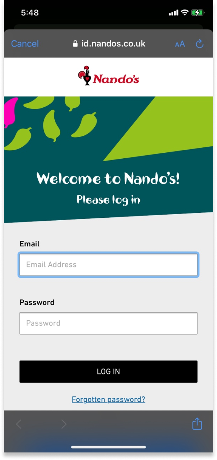
USABILITY
- It makes users confused because it goes back and forth between the application and the web site.
- It does not indicate that users are logged in after logging in.
- Credit cards are the only way users can pay.
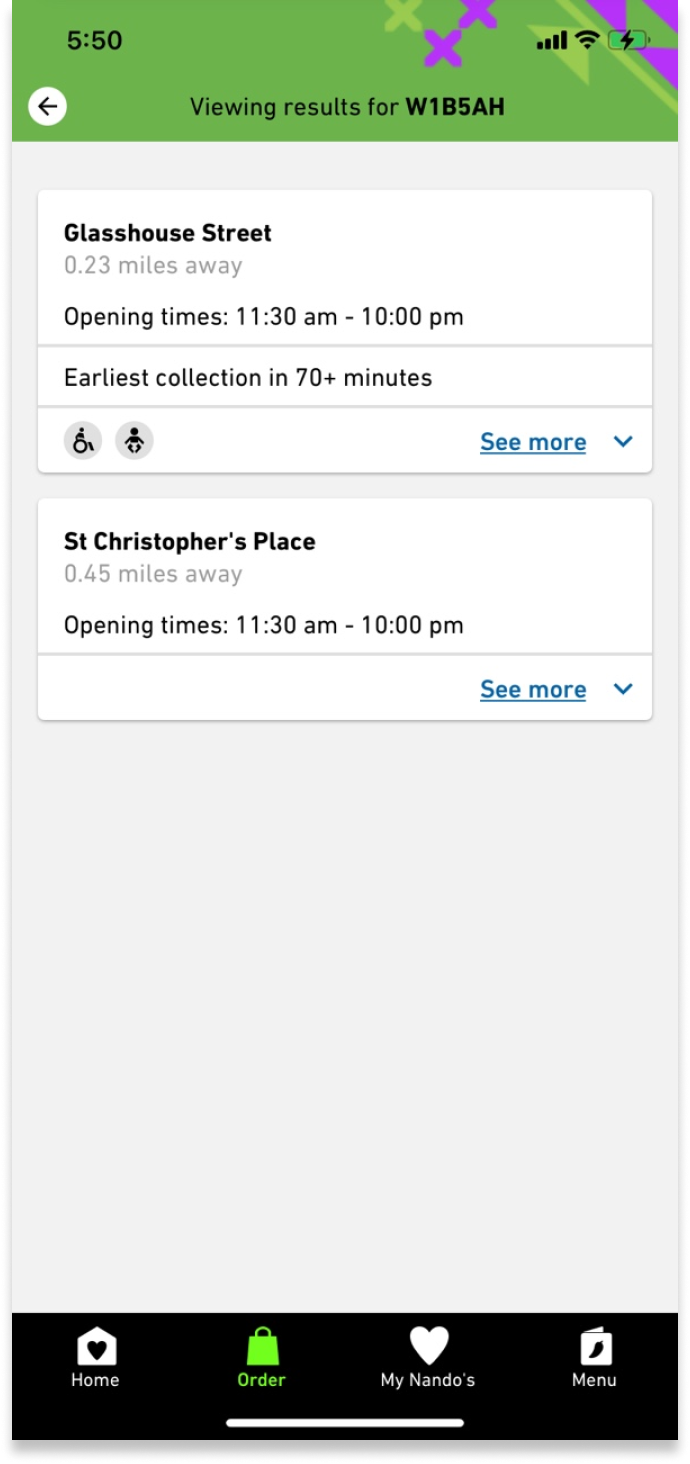
LESS INFORMATION
- There is no page that the user can check after ordering.
- It is not known in advance when users will collect before ordering.
- Each branch does not provide detailed information on operating, collectable, and deliverable hours.
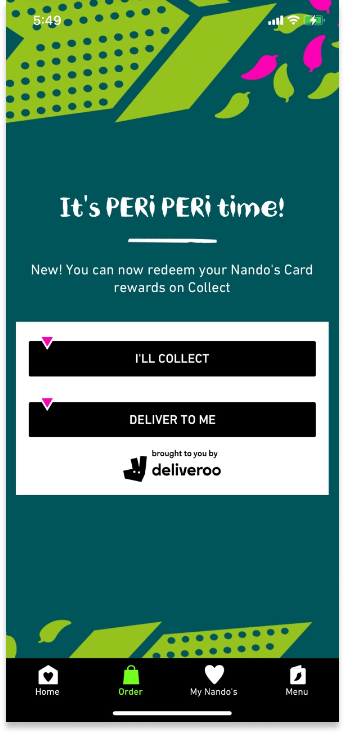
DELIVERY
- The delivery process does not work properly in this application.
- There were many reviews from users that it was convenient to deliver through Deliveroo.
- Information related to delivery is not provided.
HOW MIGHT I MAKE EASIER FOR USERS TO USE THE NANDO’S APP AND GET ACCURATE INFORMATION?
MAIN FEATURES
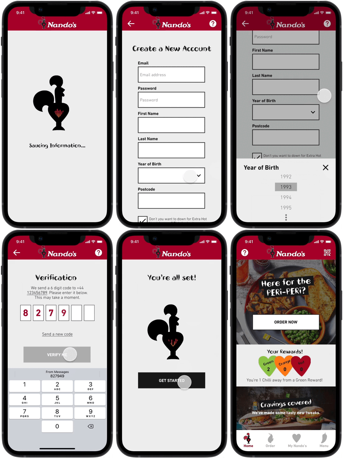
ONBOARDING
Users can sign up for membership in the application and sign up not only through mail but also through other accounts.
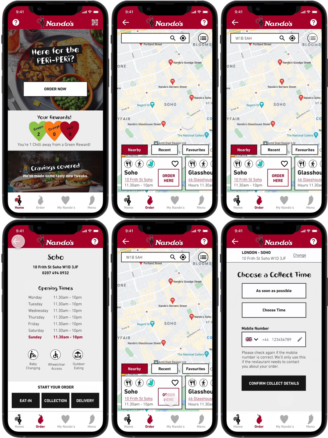
COLLECT PROCESS
Before ordering food, users can know in advance the time to collect, the information and details of the collection.

ORDER PROCESS
Users can check information about food more conveniently when ordering. Payment can be made more diversely, and users can check their order details after ordering.
DESIGN PROCESS
EMPATHISE
THE NANDO’S EXPERIENCE QUESTIONNAIRE
DEFINE
CARD SORTING
Various opinions and ideas were collected through data researches, questionnaires, and reviews from existing users. And by integrating this information, I classified the cards according to the subject.
HOW MIGHT WE & PAIN POINTS
PERSONA & USER SCENARIO & USER JOURNEY MAP
USER FLOW & APP FLOW
IDEATE
INFORMATION ARCHITECTURE
I reconstructed the details based on the basic information architecture of the Nando’s app. In particular, focusing on the usability of the app, all functions are configured to work within the app without moving to the website.
MID-FIDELITY WIREFRAMES & STYLE GUIDE
I created wire frames focusing on the process of collecting and ordering food through the app. And I also made a style guide to match the existing app and Nando’s image.
PROTOTYPE
HIGH-FIDELITY DESIGN
PROTOTYPE & INTERACTION DESIGN
TEST
USABILITY TEST
REFLECTION
WHAT I LEARNED
WHAT’S NEXT?


